1. Shape Drawing
The new UIBezierPath
class may not be one of the most talked about or publicized new
features in iPhone SDK 3.2, but if you do any kind of 2D drawing in
your app, its inclusion is actually a pretty big deal. Similar to the
vector-based drawing tools found in Adobe Illustrator and Photoshop,
the UIBezierPath class enables you to
draw straight lines, circles, rectangles, and curved shapes with
complete control over the line's stroke color and thickness, as well as
the fill color of enclosed objects.
The process of constructing a shape is relatively simple. After creating a new UIBezierPath object, you set the starting point via the moveToPoint method, and then use the addLineToPoint method for each additional connected line you wish to add to your shape. Calling the closePath method closes the shape, drawing a final line between the first point and last point. True to its name, the UIBezierPath class is also capable of creating Bézier curves. You can pass control points to the addCurveToPoint method to set the angle of the line's curve.
The aforementioned methods define the shape of your UIBezierPath. In order to render the object to your current graphics context, you call the fill and strokeUIColor to setFill and setStroke, and adjust the thickness of the line stroke by designating an integer to your path's lineWidth
property. To avoid having your fill path overlap the stroke path,
you'll want to draw the fill color before drawing the stroke outline.
This is as easy as calling the fill method before calling the stroke method. methods. Before doing so, you'll want to assign a unique.
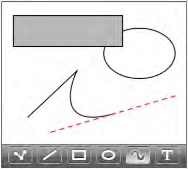
I've outlined the basics of UIBezierPath, but you're probably itching to see how all of this works in code. Figure 1 is a preview of drawing with Dudel.
Why is this graphics
functionality so important? Even if you have no aspirations to develop
a drawing app like Dudel, there are other practical uses for this
graphics class. If you need a simple shape drawn on the screen,
utilizing UIBezierPath requires
much less memory than a PNG resource image of the same shape. With a
vector-based object, only the instructions on how to draw that shape
are needed. In contrast, a bitmap image file may consume several
kilobytes (or more) when loaded into memory.
For example, let's say you're
building a task management app. To visually indicate the priority
status, your interface design places a colored dot next to each task
name. A red dot represents a high priority, an orange dot indicates
medium priority, and a yellow dot shows low priority. Using bitmap
images, the three different dots would need to be stored in your
project's Resources folder as either three separate PNG files or
consolidated within one large PNG file. Changing the priority color of
a task would require your app to load a new image resource into memory.
But if you used UIBezierPath instead,
you could create a very simple method that draws the colored dot. Need
a different color? Just pass the new color to your custom method, which
redraws the dot with the requested color.
Since conserving memory is
the name of the game, this is a very economical approach to displaying
simple 2D shapes on the screen. Limiting the number of bitmap image
resources needed is one of many ways to help reduce the memory overhead
of your app.
2. PDF Files
If you're developing an
app that creates content, then you'll find the new PDF-creation feature
to be a very welcome addition to the iPad arsenal. iOS 3.2 enables
developers to generate and save PDFs within their apps—all natively
supported within the UIKit framework. Apple has done a great job of making this process very straightforward and elegant.
First, you create a PDF graphics context by calling one of two available functions. UIGraphicsBeginPDFContextToData stores the PDF content in an NSMutableData object. The more commonly used function is UIGraphicsBeginPDFContextToFile, which saves the PDF content as a PDF file (using your requested filename parameter) to your app's sandboxed files directory.
Unlike on-screen views,
which can scroll for miles if needed, PDFs are structured as pages with
a set width and height. After establishing the PDF graphics context,
you must then create a new PDF page, so that you can draw content into
that defined area. If you wish to create a new page using the previous
default page size, then call UIGraphicsBeginPDFPage.
But if you prefer to customize the page's size and various attributes,
you should call the UIGraphicsBeginPDFPageWithInfo function instead.
The beauty of this new API is
that all of the content you pass to the PDF graphics context is
automatically translated into PDF data. After creating a new page,
anything you can draw into a custom view can be drawn into your PDF,
including text, bitmap images, and even vector-based shapes. For
content that might not fit within the bounding box of a single PDF
page, such as a large amount of text, you can call UIGraphicsBeginPDFPage or UIGraphicsBeginPDFPageWithInfo every time you need to close the current page and start a new page.
When you're finished drawing your content into the PDF graphics context, you call UIGraphicsEndPDFContext, which closes the current page and saves the PDF content to either an NSMutableData
object or a PDF file, depending on whether you originally created the
PDF graphics context via UIGraphicsBeginPDFContextToData or
UIGraphicsBeginPDFContextToFile. Once those tasks have been completed, the UIGraphicsEndPDFContext
function also performs a little housecleaning by automatically clearing
your PDF data in memory from the graphics context stack.
If your app needs to
distribute only a single image, then exporting it as a PNG or JPEG may
be the obvious path. The same holds true for plain text that's much
easier to edit when saved as an ASCII text document. But what if your
app needs to export a rendered web page or a sales report full of
visual graphs and charts? For more complex layouts that include
multiple images, tables, and styled text, saving the data as a
multipage PDF file is a great solution.
That's right, I mentioned styled text! You're not dreaming, and it's not a typo. Keep reading!
3. Core Text
As an iPhone developer, the
lack of any easy-to-use text styling functionality has probably annoyed
you on countless occasions. Sure, you can display styled text as HTML
in a UIWebView, but what about
editing that styled text? For years, you've been jealous of the
wonderful Core Text APIs that were available only to Mac OS X
developers, wishing you could tap into that same functionality within
Cocoa Touch. As of iOS 3.2, your wish has finally been granted!
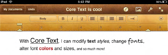
Even though Apple has
never officially confirmed that it utilizes Core Text in its stunning
word processor app, Pages for iPad (see Figure 2),
the arrival of Core Text in iPhone SDK 3.2 enables you to add similar
sophisticated styled text features to your own iPad apps.
Although all of us would love to use a word processor interface like Pages in our own apps, UIKit
does not include a ready-made word processing control for easily
editing text. To emulate such a beast, you'll need to build your own
from scratch. Rendering portions of a text string with different
styles, fonts, sizes, or colors will require quite a bit of work on
your part, but the result is well worth the effort.
Using Core Text, you draw
styled text into a graphics context. To assign custom font styles to
specific segments of your text, you collect the text with this
associated style metadata in a special attributed string, appropriately
named NSAttributedString. To add that text information via Core Text, you then create a CTFramesetter
by passing that attributed string to the function,
CTFramesetterCreateWithAttributedString. Next, you construct a CTFrame
object by passing your CTFramesetter (the styled text) and a CGPath (a
bounding rectangle area) to the CTFramesetterCreateFrame function.
Lastly, call the CTFrameDraw function to draw the styled text into the designated graphics context.
Of course, I've oversimplified
the steps here in order to give you a general idea of how Core Text is
structured. Working with Core Text can be rather complicated, so I
wouldn't recommend utilizing it for trivial text-input fields. But if
you're determined to build the next great mobile word processing
powerhouse for the iPad, then Core Text is your answer.
4. Popovers
With iPhone apps, the
small screen real estate could display only a very limited amount of
controls and content. To keep the interface clean and easy to use,
access to additional settings and elements were presented in separate
views. This required shuffling back and forth between various screens.
Even though the iPad's
larger screen size gives developers room to include more functionality
into a single, consolidated screen, the design objective still remains
the same: keep it simple. Rather than clutter the screen with an overly
complex interface, your goal should be to minimize the interface where
ever possible, allowing users to focus on your app's primary purpose
and content. To solve this problem, popovers were introduced in iPhone
SDK 3.2. Exclusive to the iPad, popovers display a secondary view on
top of the main view. Typically, this subview contains user-selectable
settings or additional contents that do not require the full screen.
A popover controller can contain
almost any kind of view you want. Although popovers are most commonly
displayed when users tap toolbar buttons, you can program a popover to
appear when tapping other types of objects, such as an image, a map
item, or a custom interface element. In The Iconfactory's Twitterrific
for iPad, tapping on a Twitter user's avatar icon conveniently presents
a popover view of that user's Twitter profile information.
The iPad places an increased
importance on toolbars. Unlike the iPhone, where toolbars are limited
to the bottom of the screen, iPad apps support toolbar placement on
both the top and bottom of your interface. In fact, since the split
view controller (introduced later in this chapter) relies on a top
toolbar layout, Apple recommends placing your toolbars at the top. In
many aspects, this actually brings iPad interface design much closer to
a traditional desktop application layout than that of an iPhone app.
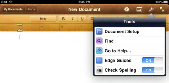
In Apple's Pages for iPad, the toolbar's buttons present popovers for choosing various document styles and settings. In Figure 3, the Tools popover shows a UITableView with several options. Some of the items even include user-selectable controls.
If your app's main toolbar
(or navigation bar) is configured with a default color, then a toolbar
within a popover will inherit the popover's native dark-blue outline.
If you assign a custom color to the toolbar, that custom color is shown
instead, with the popover's dark-blue outline surrounding the view.
With that in mind, if you insist on using a custom toolbar color, make
sure it's a color that complements the popover outline coloring.
For best results, I
recommend sticking with a default color for your app's main toolbar,
unless you modify your popover code to enforce a default color for its
own popover toolbar. For example, even though Pages uses a custom brown
color for its main toolbar, Apple decided not to implement that custom
color in its popover toolbars. This also allows a popover to visually
contrast with the interface behind it, making its hovering box easily
distinguishable from its parent view. If your popovers don't contain
their own toolbars, then this won't be an issue for you.
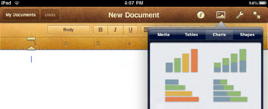
Think strategically
when designing your app's interface with popovers. Is your app
overflowing with features? Instead of piling several buttons into a
toolbar, with each one displaying a separate popover, try to
consolidate all your subviews into only a few popovers. This can be
done within a popover view by adding a segmented control to a toolbar.
Each segmented tab loads a different view into the same popover. The
feature-rich Pages for iPad effectively utilizes this concept, as shown
in the example in Figure 4.
Beyond displaying
custom views, popovers are also handy for presenting only a few
options. Instead of showing an alert sheet, a popover is the more
appropriate method on the iPad for presenting those options. A good
example of this is tapping the Add Bookmark button in Mobile Safari. On
the iPhone, an alert sheet is called. But on the iPad, alert sheets are
displayed as popovers, as shown in Figure 5.

Unlike an alert sheet, a
popover should never include a Cancel (or Close) button. If a user taps
outside a popover, the popover will disappear. But any selections made
within the popover will not automatically dismiss the popover,
requiring you to programmatically close the popover yourself. Since
Apple recommends using popovers for user-selectable options, you may
wonder why this is the case. There is actually a good reason for this
design. Since popovers generally include not only user-selectable
items, but also other tappable elements like segmented controls (as
shown in Figure 3-4),
you don't want the popover disappearing after just any finger tap. With
control over the closing of the popover, you can designate exactly how
and when the popover is dismissed based on a user's selection.
If you need users to make a
specific choice before allowing them to return to the main view, you
can force the popover to be modal (dimming the screen area behind it),
but depending on your needs, a popover may not be the ideal solution
for that use case. For many situations where that behavior is needed,
your best bet may be to present a modal view instead, as discussed in
the "Modal Presentation Styles" section later in this chapter.
Displaying a popover in your code is actually quite easy. In a nutshell, you create a new instance of UIPopoverController
and pass a custom view controller to it (which will be loaded into the
popover view). The parent view should be assigned to the popover's
delegate, so that communication can take place between the two. To show
the popover when a user taps a toolbar button, you call the presentPopoverFromBarButtonItem
method. If the popover is being displayed when a user taps another
interface element such as an image, you should call
presentPopoverFromRect instead.
The default size of a popover is
320 pixels wide and 1100 pixels tall, but you can easily customize the
width and height with the popoverContentSize
property. But you may find it interesting that the default 320-pixel
width is the same size as the iPhone's portrait mode width. That's no
coincidence! With that default width, it's much easier to convert most
existing iPhone app views into popovers when creating an iPad
version—you won't need to redesign much (if any) of the view's original
layout.
Popovers might just be one of
the most important new features of iPhone SDK 3.2. Certainly, this new
interface component will prove to be a very useful new weapon in your
iPad development arsenal.